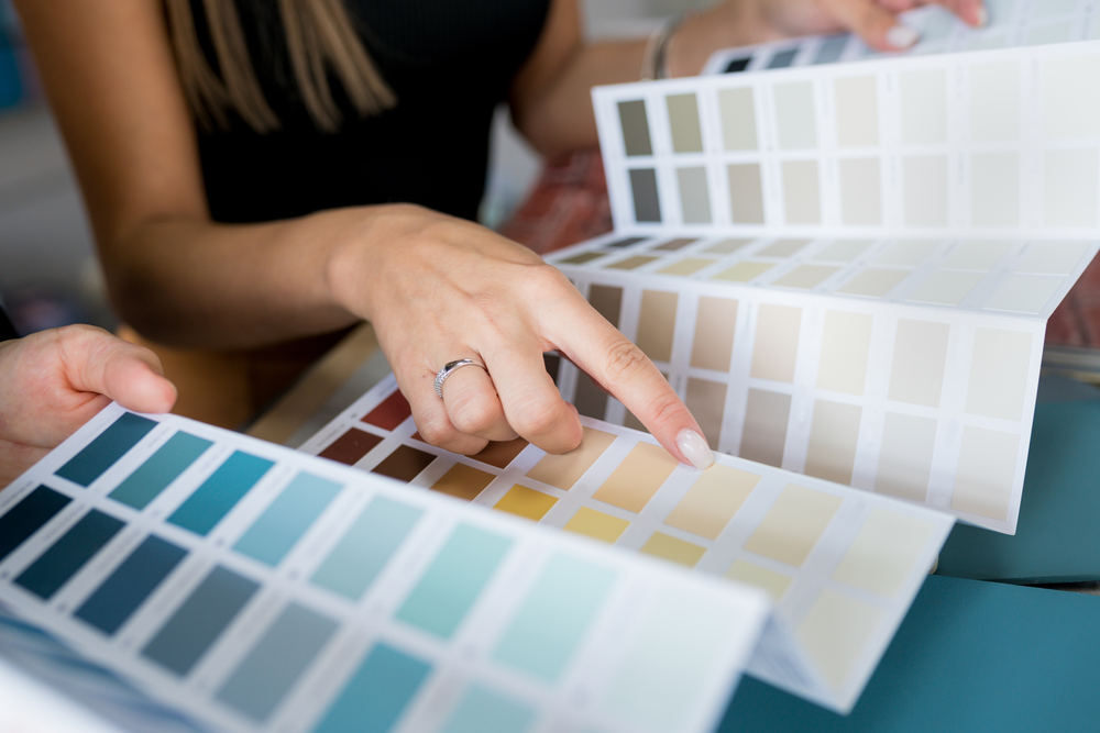
2025’s Curated Colors: Fresh Palettes That Speak to Today’s Design Trends
In 2025, color is doing more than just setting the mood—it’s making a statement. As design evolves with a renewed focus on emotional wellness, sustainability, and technological influence, curated color palettes are taking center stage. This year’s 2025 color trends capture the spirit of a world craving balance, creativity, and calm. Whether you’re remodeling, selecting new cabinetry, or curating a commercial space, these palettes are grounded in intentionality and a deep understanding of what color means today. Let’s dive into the shades and hues shaping the aesthetic direction of this year.
A Year of Duality: Grounded Neutrals Meet Hyper-Modern Accents
One of the most compelling themes in 2025 color trends is the juxtaposition of earthy, grounded tones with bolder, futuristic accents. This duality reflects both a return to nature and a forward-thinking embrace of innovation. On one end, we see the rise of rich clay reds, muted olives, and deep ocean blues—tones that connect us to the environment and echo the movement toward sustainability. These colors serve as a visual reminder of the importance of grounding ourselves amid an increasingly fast-paced, digital world.
In contrast, high-chroma hues such as digital lavender, neo-mint, and warm coral make assertive appearances as accent colors. These vibrant shades bring a burst of personality and optimism, often used in small doses to transform minimalist spaces into expressive ones. The pairing of these elements is intentional: the calming qualities of earth tones are heightened when placed next to unexpected pops of vibrancy, creating a sense of balance and intrigue.
The combination is ideal for modern interiors where individuals crave comfort without sacrificing personality. Interior design colors in 2025 aim to reflect lifestyle choices, from wellness-focused environments to high-energy creative spaces. These curated color palettes serve a dual purpose—soothing the senses while offering space for personal expression.
Interior Design Colors for Wellness-Centric Living
Wellness continues to be a key driver in design, and color is an essential tool in fostering healing environments. Interior design colors this year are rooted in biophilic principles, drawing heavily from nature’s palette to create spaces that support mental clarity, emotional stability, and physical calm. Shades like moss green, eucalyptus, desert sand, and driftwood gray are featured prominently in living rooms, bedrooms, and even bathrooms.
These colors are not only visually pleasing but also evoke a sensory experience that encourages mindfulness. Soft, sun-washed palettes bring in a feeling of airiness and light, ideal for spaces that aim to rejuvenate. The goal here is to build restorative environments that function as sanctuaries rather than simply living quarters. In this approach, color plays the role of healer and harmonizer.
Neutrals have evolved beyond the classic white-and-beige formula. Taupe with lavender undertones, mushroom gray, and ivory tinged with blush now replace sterile schemes with subtle warmth. These nuanced neutrals anchor the color story and pair effortlessly with botanical-inspired greens and sandy hues to deliver curated color palettes that feel both modern and deeply human.
Kitchen and Cabinet Color Trends: Soft Minimalism with Depth
Kitchens, often referred to as the heart of the home, are reflecting 2025’s focus on sensory depth and emotional comfort through a surge in modern cabinet finishes and innovative color applications. The trend of painted cabinetry continues to gain traction, but this year it leans into less conventional shades—think sage green, midnight teal, and ochre-infused tan.
Soft minimalism dominates this year’s modern cabinet finishes. Matte textures and low-sheen surfaces in muted yet complex hues create a sophisticated look that doesn’t overpower the space. Cabinets are often paired with natural materials like marble, walnut, and brushed brass to enhance the earthy elegance of these choices. Gone are the stark white kitchens of yesteryear; 2025 welcomes color that whispers rather than shouts.
Another trend gaining momentum is the dual-tone cabinetry design, where upper and lower cabinets are painted in complementary tones. A popular pairing is terracotta lower cabinetry contrasted with soft cream uppers, or deep navy bases topped by pale blue upper cupboards. This technique not only adds visual interest but reinforces the theme of balance and intentionality that defines this year’s aesthetic.
Curated Color Palettes in Commercial and Digital Spaces
Color has always played a powerful role in branding and user experience, but in 2025, it’s more sophisticated than ever. Curated color palettes in commercial interiors and digital interfaces are moving beyond trendiness to offer deeper brand alignment and emotional engagement. The palette must not only attract attention but also establish trust and continuity.
Corporate offices, co-working spaces, and wellness studios are leaning into palettes that merge productivity with calm—like soft clay and olive with accents of saffron or steel blue. These palettes reduce visual fatigue and promote focus, an important consideration in hybrid work environments. Color blocking is used strategically to define zones and guide flow, while still maintaining a cohesive visual story.
In digital environments, similar strategies are in play. UI and UX designers are drawing from the 2025 color trends to create experiences that feel modern yet intuitive. Pastels with clarity, like digital lilac and light cerulean, are paired with grounding neutrals to build interfaces that feel both friendly and professional. Accessibility is also top of mind—contrast and clarity are prioritized without sacrificing beauty.
Ultimately, curated color palettes in these spaces are designed to build emotional connection, enhance usability, and reflect the forward-facing values of the brands they represent.
The Psychology Behind the Palette: Why These Colors Now?
The 2025 color trends don’t exist in a vacuum—they are reflective of broader societal shifts. The prominence of natural, earthy colors stems from a global reconnection with sustainability and the outdoors, a sentiment that gained momentum post-pandemic and has only intensified. As people spend more time at home or seek meaningful experiences, colors that mimic nature help recreate a sense of openness and peace within built environments.
Simultaneously, bold accents—like vibrant orange, cobalt, and emerald—speak to a collective desire for joy and optimism amid uncertainty. These shades offer escapism, excitement, and a sense of play. They encourage creativity and self-expression, making them popular choices in personalized spaces like home offices, nurseries, and studios.
The psychology of color in 2025 is nuanced. It’s not just about what looks good; it’s about what feels good. The curated color palettes of this year are rooted in emotional intelligence. They reflect a desire to be soothed, energized, and inspired. Whether used in residential, commercial, or digital spaces, these palettes are about purposeful beauty.
ConclusioN
Color remains one of the most powerful tools in design. It tells a story, sets a tone, and shapes our experience in both conscious and subconscious ways. The curated palettes of 2025 remind us that color is more than decoration—it’s communication. And this year, what it’s saying is clear: be bold, be grounded, and above all, be intentional.